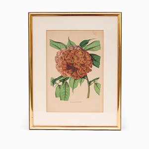
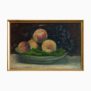
Image showing pears. Beautiful still life, painted in a realistic way. The author was inspired by the classics of Dutch baroque painting, but due to the simple composition and visible texture, the painting is also very modern.
The presented image is a beautiful study of the fruit. Pears arranged in a row but in a different configuration, some slightly tilted, others lying. Each fruit is shaped differently. The author tried to show the pear on all sides. The admiration for the detail and beauty of ordinary objects is visible here. The colors of the fruit, based on yellows and greens, are also enriched with a light glow and a kind of blush, which gives the whole a more realistic character. The whole beautifully harmonizes with the mint background.
The painting is framed in a matched passe-partout and a rustic, fluted frame.
Still life is a subject not usually popular in Dutch art, which was related to the transformations of the social structure - the increase in the number and power of the bourgeoisie and religious morality. From then on, the houses began to be filled with depictions of the world around man, not forbidden religious scenes. In the still life of the Netherlands, the highest mastery was achieved, among others, by Jan Dawidsz de Heem and Pieter Claesz.
Immagine che mostra le pere. Bella natura morta, dipinta in modo realistico. L'autore si è ispirato ai classici della pittura barocca olandese, ma grazie alla composizione semplice e alla texture visibile, il dipinto è anche molto moderno.
L'immagine presentata è un bellissimo studio della frutta. Pere disposte in fila ma in una configurazione diversa, alcune leggermente inclinate, altre sdraiate. Ogni frutto ha una forma diversa. L'autore ha cercato di mostrare la pera da tutti i lati. L'ammirazione per il dettaglio e la bellezza degli oggetti ordinari è visibile qui. I colori della frutta, basati su gialli e verdi, sono anche arricchiti da un leggero bagliore e una sorta di rossore, che dà al tutto un carattere più realistico. Il tutto si armonizza meravigliosamente con lo sfondo di menta.
Il quadro è incorniciato in un passe-partout abbinato e in una cornice rustica e scanalata.
La natura morta è un soggetto non molto popolare nell'arte olandese, che era legato alle trasformazioni della struttura sociale - l'aumento del numero e del potere della borghesia e la moralità religiosa. Da allora in poi, le case cominciarono ad essere riempite con raffigurazioni del mondo che circonda l'uomo, non con scene religiose proibite. Nella natura morta dei Paesi Bassi, la massima maestria fu raggiunta, tra gli altri, da Jan Dawidsz de Heem e Pieter Claesz.


Contattaci
Fai un'offerta
Abbiamo notato che sei nuovo su Pamono!
Accetta i Termini e condizioni e l'Informativa sulla privacy
Contattaci
Fai un'offerta
Ci siamo quasi!
Per seguire la conversazione sulla piattaforma, si prega di completare la registrazione. Per procedere con la tua offerta sulla piattaforma, ti preghiamo di completare la registrazione.Successo
Grazie per la vostra richiesta, qualcuno del nostro team vi contatterà a breve.
Se sei un professionista del design, fai domanda qui per i vantaggi del Programma Commerciale di Pamono